The secret behind the relationship between neighborhood and price in Newark, NJ
Author: Dhruvi Bhagat, Powell Hung, Shao-Ren Chen, Sheny Lin (Group 26)
Interactive Visualization
We can use a vegachart HTML tag like so:
<vegachart schema-url="/assets/json/interactiveViz.json" style="width: 100%"></vegachart>
The dashboard was created to facilitate the understanding of the relationship between “Neighborhood (in Newark, NJ)” and “Price (per night)” as well as “Room Type” and “Average Number of Review” of the Airbnb listings in Newark, NJ. This visualization is a dashboard with a heatmap on the left and a bar plot on the right.
As for design choices, “Price per night” is a quantitative value, “Neighborhood” is a discrete unordered category, and the “Room Type” is a discrete unordered category which makes it nominal as well .
We ensure the encoding of “price“ to be quantitative in order to make it work well with Altair. The color choices in this visualization is by default and if you make a selection on the heatmap, the bar plot will reflect the values accordingly. Therefore, we can see the relationship among the “Neighborhoods (in Newark, NJ)”, “Price (per night)”, “Room Type” and “Average Number of Review” of the Airbnb listings in Newark, NJ.
Contextual Visualization
Source
neighbourhoods.geojson (28.2 KB)
Contextual Visualization 1
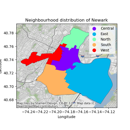
The above visualization gives us clear distribution of the neighbourhoods - Central, East, North, East and West. We can infer from above visualization that the east zone is significantly huge and the west zone is steep with covering a little portion of north as well.
This finding is in sync with the above interactive visualization where we can see that the east neighbourhood has the maximum number of average reviews. This maybe because the listings are more in the east neighbourhood (given the huge area covered by it) and thus, more number of reviews.
Contextual Visualization 2
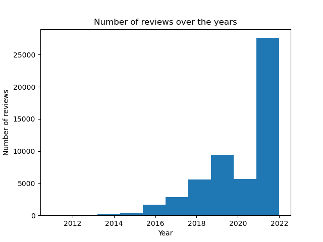
The above visualization gives us a cockpit view of the growth of Airbnb over the years. As we can see the growth in the number of reviews is exponencial except the sudden drop around the year 2020. This is probably because of pandemic where the travel industry was severely impacted. However, the number of reviews increased by double around 2022 indicating incredible growth for the company.
Search The Data & Analysis
Below is where we can put some links to both the data and the analysis code as buttons:
<div class="left">
<a class="m-1 btn btn-outline-primary btn-2 " href="https://github.com/shenylin/shenylin.github.io/blob/main/assets/json/interactiveViz.json">
  The Data
</a>
</div>

<div class="right">
<a class="m-1 btn btn-outline-primary btn-2 " href="https://github.com/shenylin/shenylin.github.io/blob/main/FinalProjPart3_group26.ipynb">
  The Analysis
</a>
</div>